1. 前言
今天,群里白垩老师问如何用python画武汉肺炎疫情地图。白垩老师是研究海洋生态与地球生物的学者,国家重点实验室成员,于不惑之年学习python,实为我等学习楷模。先前我并没有关注武汉肺炎的具体数据,也没有画过类似的数据分布图。于是就拿了两个小时,专门研究了一下,遂成此文。
2. 数据下载
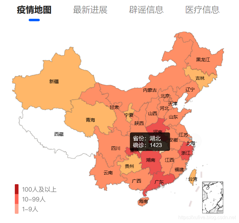
网上一搜,首先搜到的是腾讯的
疫情实时追踪
,那就用这个数据源吧。
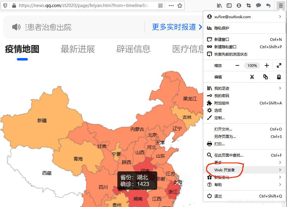
打开菜单,点击“Web开发者”,在递进菜单中选择"网络":
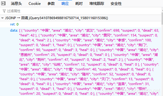
刷新页面,我们很快就能发现,应答类型为json格式的这个请求,最有可能包含我们需要的数据了:
深入分析,我们就得到了url地址、请求方法、参数、应答格式等信息。查询参数中,callback是回调函数名,我们可以尝试置空,_应该是以毫秒为单位的当前时间戳。有了这些信息,分分钟就可以抓到数据了。我们先在IDLE中以交互方式抓一下看看效果:
>> > import time, json, requests
>> > url = 'https://view.inews.qq.com/g2/getOnsInfo?name=wuwei_ww_area_counts&callback=&_=%d' % int ( time. time( ) * 1000 )
>> > data = json. loads( requests. get( url= url) . json( ) [ 'data' ] )
>> > print ( len ( data) )
301
>> > print ( data[ 0 ] )
{ 'country' : '中国' , 'area' : '湖北' , 'city' : '武汉' , 'confirm' : 698 , 'suspect' : 0 , 'dead' : 63 , 'heal' : 42 }
>> > print ( data[ - 1 ] )
{ 'country' : '中国' , 'area' : '山东' , 'city' : '枣庄' , 'confirm' : 2 , 'suspect' : 0 , 'dead' : 0 , 'heal' : 0 }
只要两行代码,就可以抓到数据了。怎么样,是不是超级简单?
3. 数据处理
以省为单位画疫情图,我们只需要统计同属一个省的所有地市的确诊数据即可。最终的数据抓取代码如下:
import time, json, requests
def catch_distribution ( ) :
"""抓取行政区域确诊分布数据"""
data = dict ( )
url = 'https://view.inews.qq.com/g2/getOnsInfo?name=wuwei_ww_area_counts&callback=&_=%d' % int ( time. time( ) * 1000 )
for item in json. loads( requests. get( url= url) . json( ) [ 'data' ] ) :
if item[ 'area' ] not in data:
data. update( { item[ 'area' ] : 0 } )
data[ item[ 'area' ] ] += int ( item[ 'confirm' ] )
return data
4. 数据可视化
数据可视化,我习惯使用matplotlib模块。matplotlib有很多扩展工具包(toolkits),比如,画3D需要mplot3d工具包,画地图的话,则需要basemap工具包,以及处理地图投影的pyproj模块。另外画海陆分界线、国界线、行政分界线等还需要shape数据。所需模块请自行安装,shape文件可以从
这里
下载,绘图用到的矢量字库可以从自己的电脑上随便找一个(我用的是simsun.ttf)。我的主程序是2019nCoV.py,shape文件下载下来之后,是这样保存的:
import time
import json
import requests
from datetime import datetime
import numpy as np
import matplotlib
import matplotlib. figure
from matplotlib. font_manager import FontProperties
from matplotlib. backends. backend_agg import FigureCanvasAgg
from matplotlib. patches import Polygon
from matplotlib. collections import PatchCollection
from mpl_toolkits. basemap import Basemap
import matplotlib. pyplot as plt
import matplotlib. dates as mdates
plt. rcParams[ 'font.sans-serif' ] = [ 'FangSong' ]
plt. rcParams[ 'axes.unicode_minus' ] = False
def catch_daily ( ) :
"""抓取每日确诊和死亡数据"""
url = 'https://view.inews.qq.com/g2/getOnsInfo?name=wuwei_ww_cn_day_counts&callback=&_=%d' % int ( time. time( ) * 1000 )
data = json. loads( requests. get( url= url) . json( ) [ 'data' ] )
data. sort( key= lambda x: x[ 'date' ] )
date_list = list ( )
confirm_list = list ( )
suspect_list = list ( )
dead_list = list ( )
heal_list = list ( )
for item in data:
month, day = item[ 'date' ] . split( '.' )
date_list. append( datetime. strptime( '2020-%s-%s' % ( month, day) , '%Y-%m-%d' ) )
confirm_list. append( int ( item[ 'confirm' ] ) )
suspect_list. append( int ( item[ 'suspect' ] ) )
dead_list. append( int ( item[ 'dead' ] ) )
heal_list. append( int ( item[ 'heal' ] ) )
return date_list, confirm_list, suspect_list, dead_list, heal_list
def catch_distribution ( ) :
"""抓取行政区域确诊分布数据"""
data = { '西藏' : 0 }
url = 'https://view.inews.qq.com/g2/getOnsInfo?name=wuwei_ww_area_counts&callback=&_=%d' % int ( time. time( ) * 1000 )
for item in json. loads( requests. get( url= url) . json( ) [ 'data' ] ) :
if item[ 'area' ] not in data:
data. update( { item[ 'area' ] : 0 } )
data[ item[ 'area' ] ] += int ( item[ 'confirm' ] )
return data
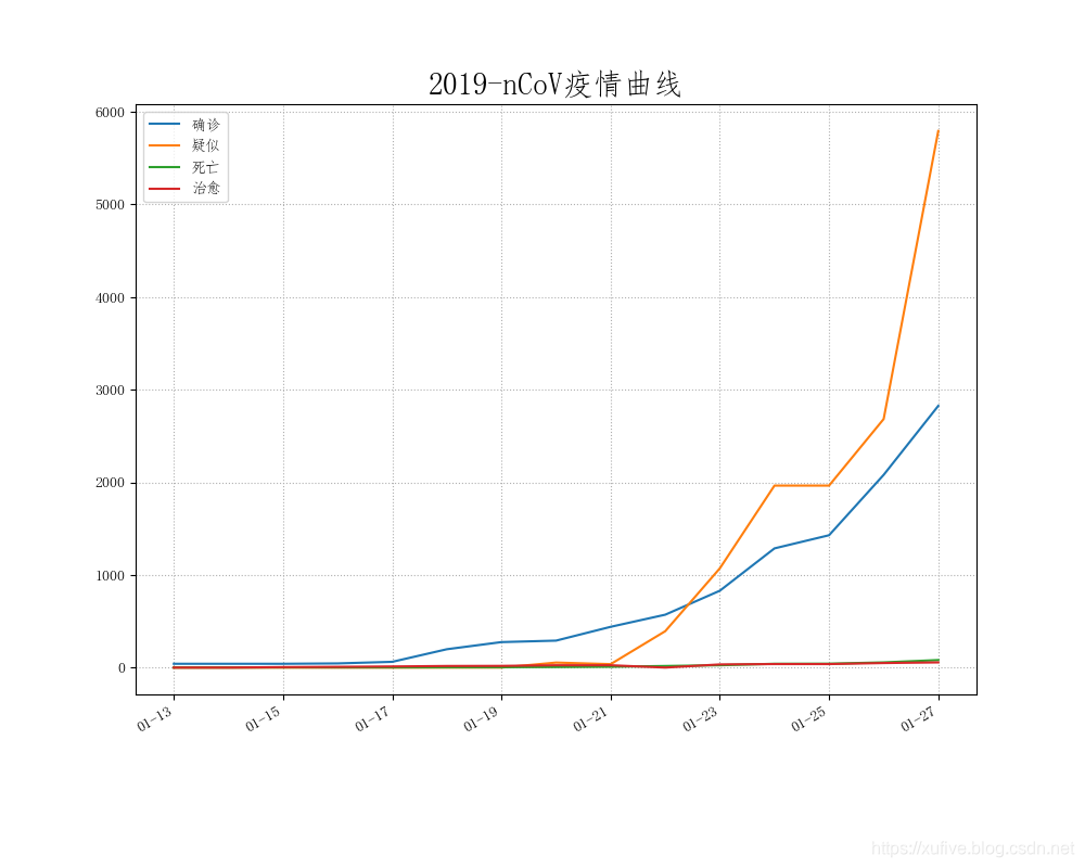
def plot_daily ( ) :
"""绘制每日确诊和死亡数据"""
date_list, confirm_list, suspect_list, dead_list, heal_list = catch_daily( )
plt. figure( '2019-nCoV疫情统计图表' , facecolor= '#f4f4f4' , figsize= ( 10 , 8 ) )
plt. title( '2019-nCoV疫情曲线' , fontsize= 20 )
plt. plot( date_list, confirm_list, label= '确诊' )
plt. plot( date_list, suspect_list, label= '疑似' )
plt. plot( date_list, dead_list, label= '死亡' )
plt. plot( date_list, heal_list, label= '治愈' )
plt. gca( ) . xaxis. set_major_formatter( mdates. DateFormatter( '%m-%d' ) )
plt. gcf( ) . autofmt_xdate( )
plt. grid( linestyle= ':' )
plt. legend( loc= 'best' )
plt. savefig( '2019-nCoV疫情曲线.png' )
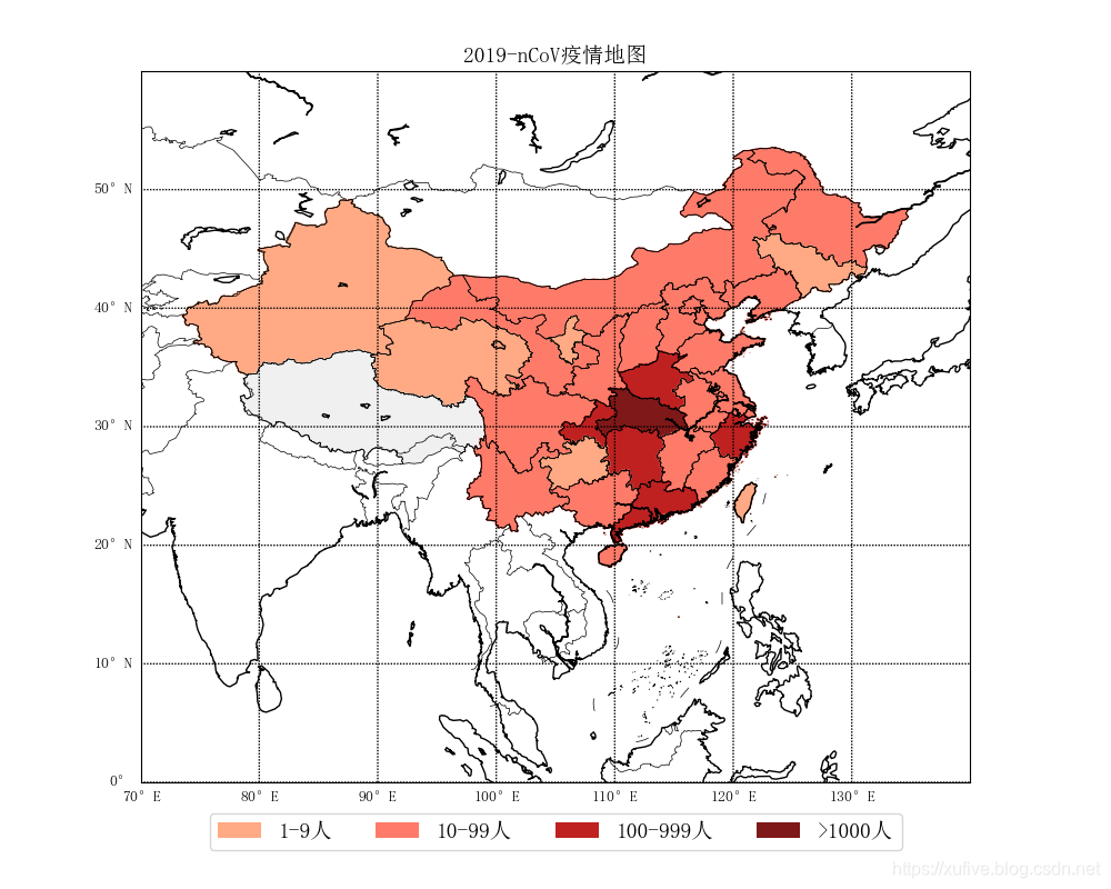
def plot_distribution ( ) :
"""绘制行政区域确诊分布数据"""
data = catch_distribution( )
font = FontProperties( fname= 'res/simsun.ttf' , size= 14 )
lat_min = 0
lat_max = 60
lon_min = 70
lon_max = 140
handles = [
matplotlib. patches. Patch( color= '#ffaa85' , alpha= 1 , linewidth= 0 ) ,
matplotlib. patches. Patch( color= '#ff7b69' , alpha= 1 , linewidth= 0 ) ,
matplotlib. patches. Patch( color= '#bf2121' , alpha= 1 , linewidth= 0 ) ,
matplotlib. patches. Patch( color= '#7f1818' , alpha= 1 , linewidth= 0 ) ,
]
labels = [ '1-9人' , '10-99人' , '100-999人' , '>1000人' ]
fig = matplotlib. figure. Figure( )
fig. set_size_inches( 10 , 8 )
axes = fig. add_axes( ( 0.1 , 0.12 , 0.8 , 0.8 ) )
m = Basemap( llcrnrlon= lon_min, urcrnrlon= lon_max, llcrnrlat= lat_min, urcrnrlat= lat_max, resolution= 'l' , ax= axes)
m. readshapefile( 'res/china-shapefiles-master/china' , 'province' , drawbounds= True )
m. readshapefile( 'res/china-shapefiles-master/china_nine_dotted_line' , 'section' , drawbounds= True )
m. drawcoastlines( color= 'black' )
m. drawcountries( color= 'black' )
m. drawparallels( np. arange( lat_min, lat_max, 10 ) , labels= [ 1 , 0 , 0 , 0 ] )
m. drawmeridians( np. arange( lon_min, lon_max, 10 ) , labels= [ 0 , 0 , 0 , 1 ] )
for info, shape in zip ( m. province_info, m. province) :
pname = info[ 'OWNER' ] . strip( '\x00' )
fcname = info[ 'FCNAME' ] . strip( '\x00' )
if pname != fcname:
continue
for key in data. keys( ) :
if key in pname:
if data[ key] == 0 :
color = '#f0f0f0'
elif data[ key] < 10 :
color = '#ffaa85'
elif data[ key] < 100 :
color = '#ff7b69'
elif data[ key] < 1000 :
color = '#bf2121'
else :
color = '#7f1818'
break
poly = Polygon( shape, facecolor= color, edgecolor= color)
axes. add_patch( poly)
axes. legend( handles, labels, bbox_to_anchor= ( 0.5 , - 0.11 ) , loc= 'lower center' , ncol= 4 , prop= font)
axes. set_title( "2019-nCoV疫情地图" , fontproperties= font)
FigureCanvasAgg( fig)
fig. savefig( '2019-nCoV疫情地图.png' )
if __name__ == '__main__' :
plot_daily( )
plot_distribution( )
1 2 3 4 5 6 7 8 9 10 11 12 13 14 15 16 17 18 19 20 21 22 23 24 25 26 27 28 29 30 31 32 33 34 35 36 37 38 39 40 41 42 43 44 45 46 47 48 49 50 51 52 53 54 55 56 57 58 59 60 61 62 63 64 65 66 67 68 69 70 71 72 73 74 75 76 77 78 79 80 81 82 83 84 85 86 87 88 89 90 91 92 93 94 95 96 97 98 99 100 101 102 103 104 105 106 107 108 109 110 111 112 113 114 115 116 117 118 119 120 121 122 123 124 125 126 127 128 129 130 131 132 133 134 135
2019-nCoV疫情曲线:
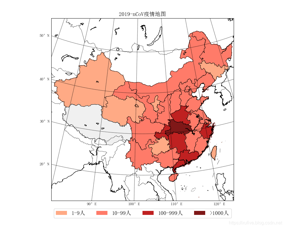
m = Basemap( projection= 'lcc' , width= 5000000 , height= 5000000 , lat_0= 36 , lon_0= 102 , resolution= 'l' , ax= axes)
兰勃托投影效果如下:
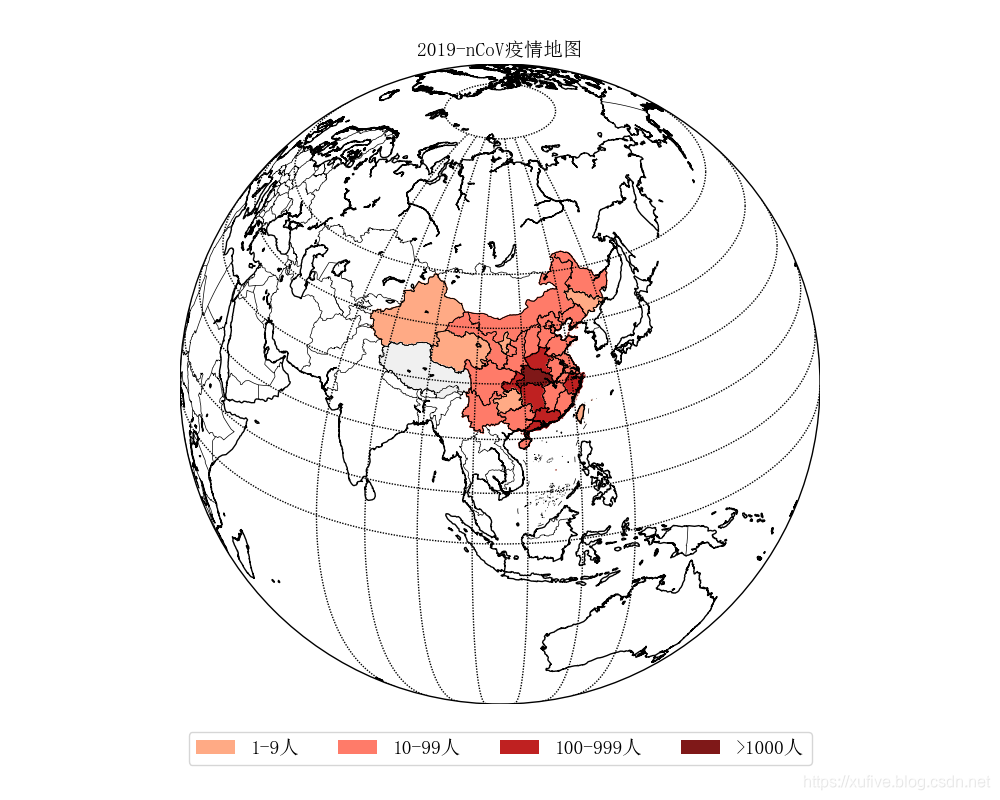
m = Basemap( projection= 'ortho' , lat_0= 30 , lon_0= 105 , resolution= 'l' , ax= axes)
正射投影效果如下: