正文
,
78
,
69
,
67
,
87
,
66
,
78
,
71
,
82
]
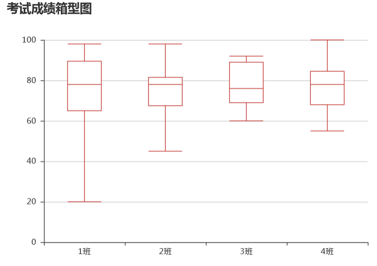
box = Boxplot(title =
'考试成绩箱型图'
,width =
600
,height =
420
)
y_prepared = box.prepare_data([y1,y2,y3,y4])
box.add(name =
''
,x_axis = x,y_axis = y_prepared)
附:用seaborn 进行小提琴图的绘制
import seaborn as sns
%matplotlib inline
%config InlineBackend.figure_format = 'svg'
sns.set(style="white", context="notebook")
sns.set_style({'font.sans-serif':['simhei', 'Arial']})
dfdata = pd.DataFrame()
dfdata['score'] = y1 + y2 + y3 + y4
dfdata['class'] = ['1班']*len(y1)+['2班']*len(y2)+['3班']*len(y3)+['4班']*len(y4)
ax = sns.violinplot(x= 'class', y = 'score',data = dfdata,
palette = 'hls',
inner = 'box'
)

5,词云图
词云图适合表现不同关键词的出现频率或重要性程度。
from pyecharts import WordCloud

words = ['python','jupyter','numpy','pandas','matplotlib','sklearn',
        'xgboost','lightGBM','simpy','keras','tensorflow',
         'hive','hadoop','spark']
counts = [100,90,65,95,50,60,70,70,20,70,80,80,60,60]

cloud = WordCloud(title = '数据算法常用工具',width = 600,height = 420)
cloud.add(name = 'utils',attr = words,value = counts,
          shape = "circle",word_size_range = (10,70))
cloud

6,地理坐标系图
地理坐标系图适合表现和国家,省份,以及城市,经纬度位置相关联的数据分布规律。
pyecharts中Geo表达和城市关联的数据,Map表达和国家和省份关联的数据。
!pip install echarts-countries-pypkg
!pip install echarts-china-provinces-pypkg
!pip install echarts-china-cities-pypkg
from pyecharts import Geo
data = [
("海门", 9),("鄂尔多斯", 12),("招远", 12),("舟山", 12),("齐齐哈尔", 14),("盐城", 15),
("惠州", 37),("江阴", 37),("蓬莱", 37),("韶关", 38),("嘉峪关", 38),("广州", 38),
("张家港", 52),("三门峡", 53),("锦州", 54),("南昌", 54),("柳州", 54),("三亚", 54),
("呼和浩特", 58),("成都", 58),("大同", 58),("镇江", 59),("桂林", 59),("张家界", 59),
("北京", 79),("徐州", 79),("衡水", 80),("包头", 80),("绵阳", 80),("乌鲁木齐", 84),
("菏泽", 194),("合肥", 229),("武汉", 273),("大庆", 279)]
geo = Geo(
"全国部分城市空气质量",
title_color="#fff",
title_pos="center",
width=800,
height=600,
background_color="#404a59",
)
attr, value = geo.cast(data)
geo.add(
"",
attr,
value,
visual_range=[0, 200],
visual_text_color="#fff",
symbol_size=15,
is_visualmap=True,
)
geo

from pyecharts import Map
value = [155, 10, 66, 78, 44, 38, 88, 50, 20]
attr = ["福建","山东","北京","上海","江西","新疆","内蒙古","云南","重庆"]
m = Map("全国省份地图", width=600, height=400)
m.add("", attr, value, maptype='china',
is_visualmap=True,
is_piecewise=True,
visual_text_color="#000",
visual_range_text=["", ""],
pieces=[
{"max": 160, "min": 81, "label": "高"},
{"max": 80, "min": 51, "label": "中"},
{"max": 50, "min": 0, "label": "低"},
])
m

from pyecharts import Map
countries= ["China", "Canada", "India", "Russia", "United States","Japan"]
capita_gdp = [13334, 43294, 5903, 23038, 53354,36162]
population = [1376048943, 35939927, 1311050527, 143456918, 321773631,126573481]
life_expectancy = [76.9,81.7,66.8,73.13,79.1,73.13]
m = Map("世界经济发展水平", width=800, height=500)
m.add(
"人均GDP",
attr = countries,
value = capita_gdp,
maptype="world",
is_visualmap=True,
visual_range = [5000,60000],
visual_text_color="#000",
is_map_symbol_show=False,
visual_orient="horizontal"
)
m

二,图表配置
小红:你上面介绍的这些基本图表都蛮实用的,做起来好像也不难。但是如果我想对图表尺寸,线型颜色,坐标轴刻度等一些细节进行调整,而不是采用默认配置,应该怎么做呢?
小明:你说的这个叫做图表配置。在pyecharts里有3种进行图表配置的方法。
第一个是修改图表主题风格:利用configure或use_theme指定图表主题风格,对图表整体颜色风格产生影响。
第二个是初始化图表通用属性:在创建图表时指定图表height,title等属性,对图像尺寸和标题等通用属性产生影响。
第三个是配置特定元素属性:可以使用add给图表配置xyAxis,datazoom,lineStyle等特定元素属性。
1,修改图表主题风格
可以使用use_theme修改单个图表主题,也可以用configure修改全局图表风格。
import random
from pyecharts import Bar
X_AXIS = ["衬衫", "羊毛衫", "雪纺衫", "裤子", "高跟鞋", "袜子"]
bar = Bar("默认主题效果", "这里是副标题")
bar.add("商家A", X_AXIS, [random.randint(10, 100) for _ in range(6)])
bar.add("商家B", X_AXIS, [random.randint(10, 100) for _ in range(6)])
bar.add("商家C", X_AXIS, [random.randint(10, 100) for _ in range(6)])
bar.add("商家D", X_AXIS, [random.randint(10, 100) for _ in


